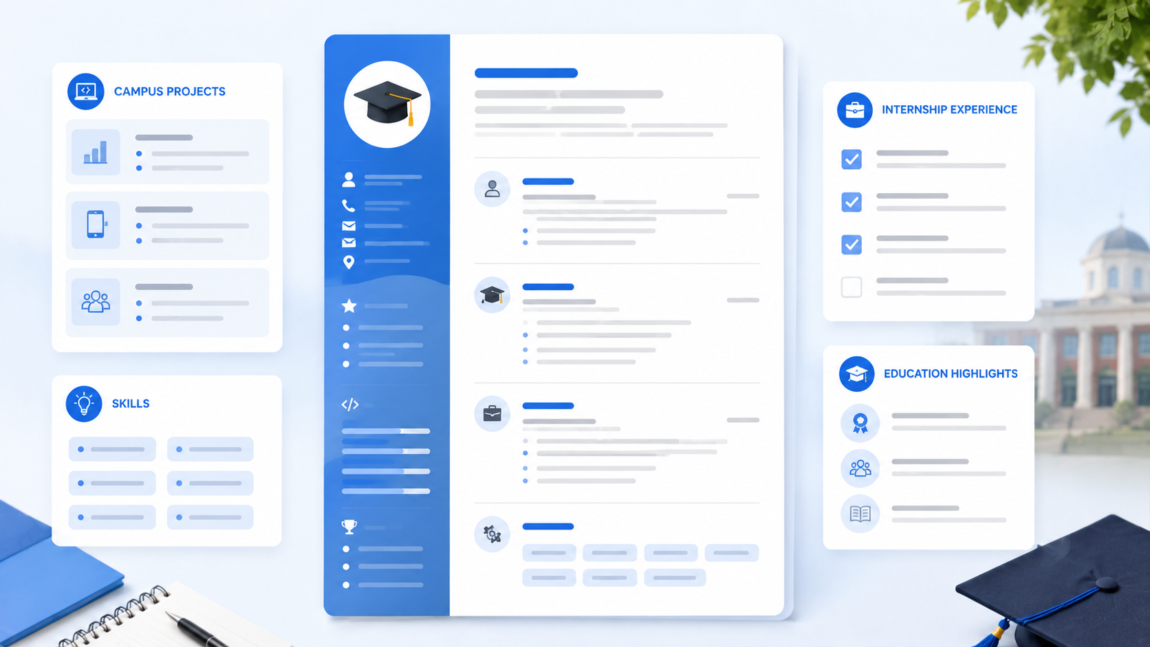
Using outdated resume templates will get your application rejected before a human recruiter even sees it. If you have been sending out dozens of applications and getting zero replies, your template choice is likely the reason why. A poor design makes your text hard to read and blocks online tracking systems from parsing your details. Many job seekers pick templates based on looks alone, ignoring how hiring managers actually read them. This will help you apply with confidence.
In this guide, you will learn how to choose the right layouts for your industry and career level. We will walk through the exact steps to organize your sections, review real-world design comparisons, and look at the errors that trigger instant rejections from hiring teams. By the end of this article, you will know how to pick a template that grabs attention, passes automated scanners, and shows employers you are the right fit for the job.
TL;DR
- Avoid complex multi-column layouts; single-column templates work best for ATS scans.
- Do not use progress bars, stars, or visual icons to rate your skills.
- Place your contact details at the very top of the page rather than inside headers or footers.
- Use standard fonts and neutral colors to keep your formatting clean and professional.
Table of Contents
What Makes Good Resume Templates Actually Work?
Think of your resume layout like a store window. A messy store window with too many signs and lights makes people walk past. A clean, organized window makes people stop and look inside. Your resume templates need to do the same thing for your career. If you choose a template with too many colors, columns, or graphics, recruiters will skip your profile in under five seconds.
A good template focuses on readability. It guides the reader's eye to your most important achievements. Many websites offer free resume templates that look great but fail online scanning systems. Here is what you need to look for in a successful design:
- Single-column layout: Single-column formats are easier for both human readers and automated systems to scan.
- Clear hierarchy: Bold headings and bullet points help recruiters find your skills and experience quickly.
- Plenty of white space: Leaving empty space around your text keeps your page looking clean and professional.
A clean resume design is crucial to make a good first impression. It shows you are professional and respect the recruiter's time.
How to Select and Format Your Template Step-by-Step
Step 1: Choose resume templates that fit your career level
First, look at your professional background to decide which structure fits your needs. If you are a college graduate or changing careers, you want templates that place your education and projects near the top. Experienced workers should use professional resume templates that highlight work history and metrics. Choosing the wrong layout can hide your strongest assets and make you look unqualified for the role. Read our full resume format guide to pick the layout for your background.
Step 2: Use a tool to handle the formatting
Instead of fighting with margins in Word, use a tool that does the work for you. Free tools like aicvcreate.com handle this automatically—you pick a template, fill in your details, and download a perfectly formatted PDF that matches the job description. Using an online resume builder makes this step incredibly simple and saves you hours of work.
Step 3: Keep your resume design clean and avoid complex graphics
Remove all custom icons, progress bars, and multiple columns from your page. These elements can confuse applicant tracking systems and make your document look messy. A clean layout ensures that every word of your text is readable. Here is a comparison of how different template choices affect readability:
| Outdated / Complex Templates | Modern / ATS-Friendly Templates |
|---|---|
| Multiple columns, photo placeholders, and colored skill progress bars. | Single-column layout with clear font hierarchy and bullet points. |
| Contact details placed inside headers or footers where systems miss them. | Contact details listed clearly at the very top of the page. |
As you can see, simplicity is much more effective than complex design.
Step 4: Pick standard fonts and colors
Make sure your resume format uses standard fonts like Arial, Calibri, or Helvetica. Keep your colors simple, using black text with small touches of dark blue or gray for headings. Avoid bright colors or decorative fonts that look unprofessional. Standard fonts ensure that computer systems can read your text without errors. Make sure to review the best skills to put on a resume in 2026 to list them correctly.
Step 5: Test the template readability
Save your finished document as a PDF and open it on different screens to check the margins. Ask a friend to look at it for five seconds and tell you what they remember. If they cannot find your job title or key skills right away, you need to adjust your layout. A good template should highlight your value instantly. Make sure all sections are aligned and there are no overlapping text boxes.
Common Template Mistakes to Avoid
Many job seekers pick a template based on personal taste without thinking about how recruiters or tracking software read the page. A template that looks beautiful to you might be unreadable to a computer. Avoid these four common mistakes when choosing your layout:
- Selecting resume templates with complex multi-column layouts. While side-by-side columns look modern, they often confuse automated scanning systems. The software may read your text out of order, mixing your skills with your work history.
- Choosing a resume design with too many colors or custom fonts. Using multiple colors or decorative text makes your page look messy and hard to read. Stick to one or two neutral colors and standard fonts to maintain a professional appearance.
- Using graphic elements like skill bars or icons. Graphic rating scales for skills are highly subjective and waste space. A recruiter does not know what "four out of five stars" in Excel means; they want to see your real achievements in writing.
- Using a resume format that places contact details in the header or footer. Automated scanners often ignore the header and footer sections of a document. If you place your email or phone number in these areas, employers may not be able to contact you.
Pro Tips for a Better Resume Layout
Getting your template right requires attention to detail. A few minor layout adjustments can make your document look twice as professional. Use these advanced strategies to polish your page:
- Keep your margins set to one inch. We recommend using professional resume templates that keep margins at one inch on all sides. This leaves enough white space to make your page look clean while ensuring you have enough room for your text.
- Use standard section headings. Label your sections with common names like "Work Experience," "Skills," and "Education." Do not use creative titles like "My Professional Journey" or "Where I Have Worked," as scanning systems might miss them.
- Align your dates to the right. Place your employment dates on the right side of the page, opposite your job titles. This clean alignment makes it easy for recruiters to scan your career timeline in a split second.
★ PRO TIP: Your resume design should reflect the industry you are applying to. Creative roles in design or marketing can use subtle color accents, while traditional roles in finance or law should stick to a classic black-and-white look. You can use aicvcreate.com to test different template styles and see which one fits your target industry best. The builder allows you to swap templates with one click without losing your text.
Case Study: Rebuilding a Resume for an Office Assistant
Let's look at a real-world example of how template design affects job search results. We helped an office assistant pick simple resume templates to target administrative roles. The candidate had three years of experience but was not getting any replies.
Their original document used a complex creative template:
The page had a large blue sidebar, a photo placeholder, and contact details hidden in the footer. It also used graphic circles to rate their proficiency in administrative software.
This layout caused two main issues. The tracking software could not parse the contact details, and the sidebar squeezed their experience into a narrow column, making it look cluttered.
We helped them transition to a clean, single-column design:
We placed their contact info at the top, removed the photo placeholder, and replaced the rating circles with a simple bulleted list of skills. We also aligned their work history chronologically with clear headings.
Why did this change work? First, the automated scanners could easily read their contact info and work dates. Second, the clean layout allowed hiring managers to review their experience in under five seconds. The candidate received four interview invitations within ten days of updating their template.
We also worked with a recent graduate who was using a multi-column template with a large decorative header. The header took up a third of the page, leaving very little space for their academic projects. We helped them switch to a clean format that prioritized their coursework and volunteer experience. This simple design change made their credentials look more substantial and professional, helping them secure an internship within two weeks.
Build Your Resume Free with AICV Create
Finding the perfect template does not have to be frustrating. Our online resume builder helps you choose the right template and customize it for your target job in minutes. Get access to our collection of free resume templates and apply to your dream job with confidence.
- ATS-friendly templates that pass automated scanners
- AI writing suggestions to highlight your achievements
- Instant PDF download with no hidden fees
→ Create your free resume at aicvcreate.com — no account needed to get started.
Frequently Asked Questions
Where can I download free resume templates?
You can download free resume templates on major career sites and resume writing blogs. However, many of these files are not optimized for online scanning systems. Using aicvcreate.com ensures you get templates that look professional and pass automated filters.
Are Google Docs resume templates ATS-friendly?
Some Google Docs layouts are ATS-friendly, but many use tables, columns, or headers that can confuse scanning software. If you use them, make sure to keep your formatting simple and avoid placing important information in text boxes.
Should I pay for professional resume designs?
No, you do not need to pay for professional designs. Modern online tools offer high-quality, ATS-compatible designs for free. You should focus on writing strong content rather than spending money on expensive templates.
What is the best resume format for a beginner?
The best resume format for a beginner is a single-column chronological layout that places education and projects above work experience. This structure highlights your academic training and skills while keeping the document easy to read.
Is a resume builder better than Word?
Yes, using a resume builder is usually better because it prevents formatting errors. Word documents often get messy when you adjust margins or add bullet points, while a builder keeps your layout perfectly aligned automatically.